• Join ccmfans.net

    ccmfans.net is the Central Coast Mariners fan community, and was formed in 2004, so basically the beginning of time for the Mariners. Things have changed a lot over the years, but one thing has remained constant and that is our love of the Mariners. People come and go, some like to post a lot and others just like to read. It's up to you how you participate in the community!

    If you want to get rid of this message, simply click on Join Now or head over to https://www.ccmfans.net/community/register/ to join the community! It only takes a few minutes, and joining will let you post your thoughts and opinions on all things Mariners, Football, and whatever else pops into your mind. If posting is not your thing, you can interact in other ways, including voting on polls, and unlock options only available to community members.

    ccmfans.net is not only for Mariners fans either. Most of us are bonded by our support for the Mariners, but if you are a fan of another club (except the Scum, come on, we need some standards), feel free to join and get into some banter.

Mariners playing strip- ACL and 09/10 season

morrijo

Well-Known Member
Dont like the new shirts.

We currently have the best home strip ( Perths is also Good )

Nice big central coast on the front and easy to read the names on the back against the yellow.

Away strip look like T shirts from best and less

They payed money for that .

How will the sponsorship look.

Should hae stuck with what they had.
 

northernspirit

Well-Known Member
morrijo said:
Dont like the new shirts.

We currently have the best home strip ( Perths is also Good )

Nice big central coast on the front and easy to read the names on the back against the yellow.

Away strip look like T shirts from best and less

They payed money for that .

How will the sponsorship look.

Should hae stuck with what they had.
agree with the best and less call re: away kit, it is pretty awful
i dont mind the home kit although would have been much much better if it were thinner stripes like Dibo posted, overall pretty underwhelmed with it all
 

Jimmy

Well-Known Member
The gold trimming wasn't a nessecity, there are no rules on it.
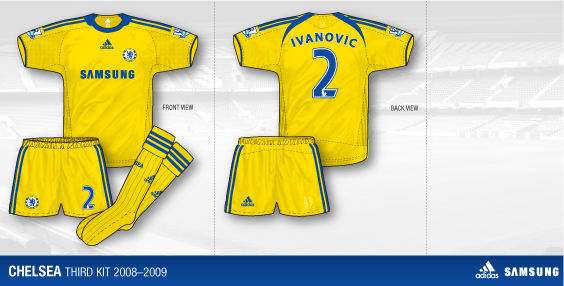
Up close the yellow jersy looks.... cheap. The sewing lines on it are different, and don't look right.

I agree with Floss on the whole yellow kit. Eg: Chelsea this season.
chelsea-3-08-09.gif
 

Paolo

Well-Known Member
morrijo said:
Dont like the new shirts.

We currently have the best home strip ( Perths is also Good )

Nice big central coast on the front and easy to read the names on the back against the yellow.

Away strip look like T shirts from best and less

They payed money for that .

How will the sponsorship look.

Should hae stuck with what they had.
1. not sure how we have 'the best' home strip as its the same design as 3 other clubs, whilst glorys is also the same as 2 other clubs

2. i assume the backs are navy(jimmy can confirm?) therefore names will be easier to read

3. Numbers wont be on the front for the league which means your precious sponsorship will be there'

4. agree that away shirt looks dodgy
 

Jimmy

Well-Known Member
keensy said:
morrijo said:
Dont like the new shirts.

We currently have the best home strip ( Perths is also Good )

Nice big central coast on the front and easy to read the names on the back against the yellow.

Away strip look like T shirts from best and less

They payed money for that .

How will the sponsorship look.

Should hae stuck with what they had.
1. not sure how we have 'the best' home strip as its the same design as 3 other clubs, whilst glorys is also the same as 2 other clubs

2. i assume the backs are navy(jimmy can confirm?) therefore names will be easier to read

3. Numbers wont be on the front for the league which means your precious sponsorship will be there'

4. agree that away shirt looks dodgy

There's stripes down the back with blue square covering the yellow striped under the number, cant really remember the name part sorry, but I'm guessing that'd be the same.
 

Ranyen

Well-Known Member
Horrible, Horrible. I am going to lead a protest by wearing my V4 jersey & never purchasing these one's. Anybody with?
 

Paolo

Well-Known Member
Ranyen said:
Horrible, Horrible. I am going to lead a protest by wearing my V4 jersey & never purchasing these one's. Anybody with?
please refrain from protesting, otherwise you will be labelled pathetic etc by mr celery
 

Paolo

Well-Known Member
This thread has got me thinking about past suggestions.

rather then vertical stripes i would have preferred a parma style shirt
1998.99-Chiesa-Home-fronte.jpg
1999.00-Thuram-Home-fronte.jpg
2000.01-Amoroso-Home-fronte.jpg
2001.02-Milosevic-Home-fronte.jpg
2003.04-Gilardino-Home-fronte.jpg


For the away strip i would have liked our original shirt back with blue trim replacing the white trim......wouldnt mind the player back either
00000231-Photo.jpg
 

graaant

Well-Known Member
http://www.guardian.co.uk/science/2008/sep/12/slimming.stripes

"Vertical stripes don't flatter - they make you look fatter"

Oh Hutcho..
 

Jorome Alexander Bennett

Well-Known Member
~Floss~ said:
IMO One strip should be highly-contrasting colours (yellow + navy) and the other must be a plain/solid colour, different to the dominant colour of the contrasting strip (eg. all yellow shirt+socks+shorts).

If our new home strip clashes with Wellington, then yellow shirt/dark shorts woulnd't be much better.

On another note this is a great move by the club/FFA, as I'm actually considering whether I would buy both shirts. I'm sure plenty more people would be thinking this compared to when every club had virtually the same away strip.

+1 for all of that.

The strips will look a lot less like training kit when they are adorned with club/competition ensignias and sponsors.

I look forward to off-centre club badge.

n550286353_2144341_3113.jpg
 

Ranyen

Well-Known Member
keensy said:
Ranyen said:
Horrible, Horrible. I am going to lead a protest by wearing my V4 jersey & never purchasing these one's. Anybody with?
please refrain from protesting, otherwise you will be labelled pathetic etc by mr celery

Wasn't going to buy one anyway. I got a new one in December. I'm trying to average my Jersey purchasing to One a year.
 

Paolo

Well-Known Member
have been able to get my hands on the amended version for the regular season...quite a scoop
mm.jpg
 

Marquee

Well-Known Member
First opinion was a bit of a shock, the pictures make it look very bland and unimaginative, much like a training kit.

However, went down and visited Mariners HQ and asked to have a look at the home strip. I must say it looks better in real life. It reminds me of the strips we wore Pre Season Cup V1, especially the away. It definitely needs some sponsors and logos to create a bit more appeal. Something to spice it up.
 

marinermick

Well-Known Member
yellowfidello said:
First opinion was a bit of a shock, the pictures make it look very bland and unimaginative, much like a training kit.

However, went down and visited Mariners HQ and asked to have a look at the home strip. I must say it looks better in real life. It reminds me of the strips we wore Pre Season Cup V1, especially the away. It definitely needs some sponsors and logos to create a bit more appeal. Something to spice it up.

cheers for that

am waiting to see it in real life before i make a judgement
 

Online statistics

Members online
43
Guests online
366
Total visitors
409

Forum statistics

Threads
6,821
Messages
399,796
Members
2,778
Latest member
Diem phuc
Top