• Join ccmfans.net

    ccmfans.net is the Central Coast Mariners fan community, and was formed in 2004, so basically the beginning of time for the Mariners. Things have changed a lot over the years, but one thing has remained constant and that is our love of the Mariners. People come and go, some like to post a lot and others just like to read. It's up to you how you participate in the community!

    If you want to get rid of this message, simply click on Join Now or head over to https://www.ccmfans.net/community/register/ to join the community! It only takes a few minutes, and joining will let you post your thoughts and opinions on all things Mariners, Football, and whatever else pops into your mind. If posting is not your thing, you can interact in other ways, including voting on polls, and unlock options only available to community members.

    ccmfans.net is not only for Mariners fans either. Most of us are bonded by our support for the Mariners, but if you are a fan of another club (except the Scum, come on, we need some standards), feel free to join and get into some banter.

Mariners playing strip- ACL and 09/10 season

morrijo

Well-Known Member
Spoke to a team owner of another club.

He is off to the Ivy bar tonight for the Annual dinner awards thingy

he told me that clubs had a choice not to have stripes on the back of the home strip.

he said they were given about 4 options.

This club went went for 1 colour.


Not much yellow on Home strip

used to be 80% yellow lucky to be 30%

They just want $$ from merchandising

Is this the best Rebock coul come up with.

The mock ups of designs on this site have been far better

 

Andy

Well-Known Member
marinermick said:
yellowfidello said:
First opinion was a bit of a shock, the pictures make it look very bland and unimaginative, much like a training kit.

However, went down and visited Mariners HQ and asked to have a look at the home strip. I must say it looks better in real life. It reminds me of the strips we wore Pre Season Cup V1, especially the away. It definitely needs some sponsors and logos to create a bit more appeal. Something to spice it up.

cheers for that

am waiting to see it in real life before i make a judgement

Same here.

I remember I hated the jersey we had now after I first saw pictures, but really liked it once I saw it in the flesh. Here's hoping this one's the same.
 

dibo

Well-Known Member
morrijo said:
Not much yellow on Home strip

used to be 80% yellow lucky to be 30%

there's nothing actually wrong with that. the club's got a jersey that after a little while we'll be very used to and will become iconic and recognisably ours. it may be that all along they wanted it this way (navy, mariners... geddit?), but because of the white away kits rule and melbourne's colours it was impossible.

morrijo said:
They just want $$ from merchandising

Is this the best Rebock coul come up with.

The mock ups of designs on this site have been far better
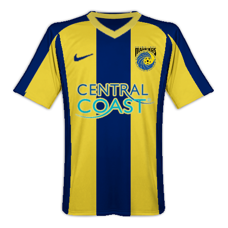
of course the club want $$$ from merchandise. that's football!

Reebok and the club together worked out what they wanted and this is the result, not everyone is going to like it but that's the way of the world. i doubt anyone at the club is going to slit their wrists because of a few unfavourable reactions, especially considering on the whole the reaction is pretty positive.
 

Guns of Melbourne

Well-Known Member
MattSimon said:
Tis a lot of fun messing about with the templates. Here's Barca style:
barcastyle.png

Nice work for being the closest.

Good stuff CCM, best looking shirts the A-League has ever seen (apart from the Big-V, of course)
 

Guns of Melbourne

Well-Known Member
keensy said:
For the away strip i would have liked our original shirt back with blue trim replacing the white trim......wouldnt mind the player back either
00000231-Photo.jpg

Well you can't have him back. He's home and where he belongs ;D

Besides, you got that sooky kent Caceras. Isn't that enough for you?
 

Paolo

Well-Known Member
Guns of Melbourne said:
MattSimon said:
Tis a lot of fun messing about with the templates. Here's Barca style:
barcastyle.png

Nice work for being the closest.
without being too much different, i do think that this barca design looks much much better due to the sleeves not being a solid colour and bit more yellow

p.s how about a cash + player deal for tommy?
 

Guns of Melbourne

Well-Known Member
The only player I would take would be Matt Simon, but we don't need him with Archie, Allsopp & Fabiano all sticking around next season.

Maybe Boogs, but there would have to be a lot of cash involved ;D
 

Paolo

Well-Known Member
Guns of Melbourne said:
The only player I would take would be Matt Simon, but we don't need him with Archie, Allsopp & Fabiano all sticking around next season.

Maybe Boogs, but there would have to be a lot of cash involved ;D
how about D'Apuzzo + the knowledge that we would be forever thankful??? it's my final offer
 

Guns of Melbourne

Well-Known Member
keensy said:
Guns of Melbourne said:
The only player I would take would be Matt Simon, but we don't need him with Archie, Allsopp & Fabiano all sticking around next season.

Maybe Boogs, but there would have to be a lot of cash involved ;D
how about D'Apuzzo + the knowledge that we would be forever thankful??? it's my final offer

user-8622439_1163386495.jpg


Andrew+OKeefe..JPG
 

dibo

Well-Known Member
Guns of Melbourne said:
The only player I would take would be Matt Simon, but we don't need him with Archie, Allsopp & Fabiano all sticking around next season.

Maybe Boogs, but there would have to be a lot of cash involved ;D

yeah, we'd be asking a fair bit.

why not greg owens? i'm sure melbourne supporters have warm memories of watching him at left back? ;D
 

serious14

Well-Known Member
Arabmariner said:
Those shirts are horrible.Ah well another couple of years for the old V1 shirt. :(

Mine has no logo's or badges left...... It's literally just a colored jersey.  :eek:
 

Arabmariner

Well-Known Member
serious14 said:
Arabmariner said:
Those shirts are horrible.Ah well another couple of years for the old V1 shirt. :(

Mine has no logo's or badges left...... It's literally just a colored jersey.  :eek:
My daughters one is the same.I just asked her which of the new ones she wanted and she said she doesn't want one "cos they're horrible".............. ???

I think they should redesign the shirts and not waste so much material on the long johns!! :eek:
 

Redline

Well-Known Member
Wilko looks like he's wearing an OHS Hi Viz safety vest tbh.

I'm not a fan, and I agree with the best and less call on the away strip...and the white shorts looks out of place.
 

Redline

Well-Known Member
Jorome Alexander Bennett said:
~Floss~ said:
IMO One strip should be highly-contrasting colours (yellow + navy) and the other must be a plain/solid colour, different to the dominant colour of the contrasting strip (eg. all yellow shirt+socks+shorts).

If our new home strip clashes with Wellington, then yellow shirt/dark shorts woulnd't be much better.

On another note this is a great move by the club/FFA, as I'm actually considering whether I would buy both shirts. I'm sure plenty more people would be thinking this compared to when every club had virtually the same away strip.

+1 for all of that.

The strips will look a lot less like training kit when they are adorned with club/competition ensignias and sponsors.

I look forward to off-centre club badge.

n550286353_2144341_3113.jpg

2 bright yellow stripes on the outside. When  wear one over my black work shirt, looks very similar to that.
 

Online statistics

Members online
16
Guests online
324
Total visitors
340

Forum statistics

Threads
6,835
Messages
401,521
Members
2,796
Latest member
JosephHoafe
Top