• Join ccmfans.net

    ccmfans.net is the Central Coast Mariners fan community, and was formed in 2004, so basically the beginning of time for the Mariners. Things have changed a lot over the years, but one thing has remained constant and that is our love of the Mariners. People come and go, some like to post a lot and others just like to read. It's up to you how you participate in the community!

    If you want to get rid of this message, simply click on Join Now or head over to https://www.ccmfans.net/community/register/ to join the community! It only takes a few minutes, and joining will let you post your thoughts and opinions on all things Mariners, Football, and whatever else pops into your mind. If posting is not your thing, you can interact in other ways, including voting on polls, and unlock options only available to community members.

    ccmfans.net is not only for Mariners fans either. Most of us are bonded by our support for the Mariners, but if you are a fan of another club (except the Scum, come on, we need some standards), feel free to join and get into some banter.

New jersey! HAL11

Rowdy

Well-Known Member
.We don't need small club mentality. Merchandising when done well can make a lot of money. And we know our club would like more dosh in the kitty.

I'd love to spend more of my money on merch, but year after year it's just not good enough design wise.

I planned on buying a new jersey every year/(release). I own 5- one of which is the first 'all-yellow away strip' with the black stitched seams & another the kappa 'high-neck' which I hated but was 'gifted' to me by a family member.

Still freezing my nutz off every year for 10 years waiting for them to produce an 'all yellow' jacket. NOT any old yellow, but the team's yellow! (Note to Merch Manager: Season 1 jersey IS OUR YELLOW!)

If it ain't Yellow, I ain't buying it! I want to float in a Sea of Yellow.

If only CCMFC realised that the lower $$$ initial payment from doing a deal w/ a NIKE or ADIDAS is more than made up in increased sales of a better designed & better quality product than a Krappa or Hum-drummel.

WSW & SYD FC both sell their respective Nike/Adidas jerseys for $90.

We sell our Krappa for $120. Hummel was $120.
 

Rowdy

Well-Known Member
Registered & Just voted! But nowhere to read mine or others comments left when signing ? dumb.

Also voted for "Kyle Sandilands to retire", seemed a worthy cause.
 

Big Al

Well-Known Member
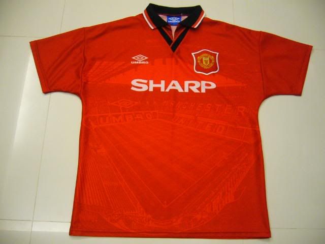
Years ago, Manchester United had just 'completed' Old Trafford. Its four sides were all finished off as modern all-seater stands with corners filled in, so the ground was brought together in one basically seamless surrounding tier with rooves all meeting etc.

The club was very proud that their 'masterplan' had been completed and celebrated by putting an image of the ground on the shirt. For two years the kit that had an image of the newly wiz-bang Old Trafford woven into the fabric. It was just contrasting matte and shiny weave fabric.

1993_94Home01.jpg


I was about 12 when it came out and I thought it was the duck's nuts.

Of course they waited about a year before they put another two decks on the northern stand and began their new masterplan (which appears to be to keep plastering new bits on until it all collapses under the weight of its own self-importance), but I digress.

Instead of putting a f**king palm tree on the shirt, it'd have been amazing if there could be a *subtle* image of our ground worked into the jersey somehow.

It's not like we don't have iconic images that would be perfect for the job:

2007-11-4-77673556.jpg


But instead we got a really pretty ordinary looking palm tree slapped on.
Bloody hindsight or there is always next year.
Although I doubt they will be as brave.

I am coming around only purely because everyone hates it especially our rivals.
 
  • Like
Reactions: adz

Big Al

Well-Known Member
I understand what they tried by including members who bought merchandise,

So I think this forum should pertisian to be given ago next year. The angle could be we are a club sponsor (are we again this year?).
With designs like Dibo's Man U rip off to the crafty designers on here I'm sure we could come up with a team to produce our best kit yet.
 

Rowdy

Well-Known Member
I signed the online petition to dump the jersey & added the comment (although no-one can see the comments) 'all members' should be given a vote &/or chance to submit a design 'if your de'zigny enough'.

If your NOT a member you dont vote. Might make some think about signing-up just for the chance to vote. :cool:
 
Last edited:

Gratis

Well-Known Member
the more i look at the new kit the more i don't mind it. i don't think i'll ever look at it and think 'gee that looks good' but as I'm getting used to it it's fine
worth it for a bit of chararcter and definition maybe. that said if they tweaked it to be a little more classy i wouldn't mind
i think this picture helped, when i look at it as a whole effect
ed53aced018aeea53ede564ddb07a491
 
Last edited:

localpom

Well-Known Member
the more i look at the new kit the more i don't mind it. i don't think i'll ever look it and think 'gee that looks good' but getting used it it it's fine
worth it for a bit of chararcter and definition maybe. that said if they tweaked it to be a little more classy i wouldn't mind
I think it will grow on me too. Think it will be one of those kits that people will either love or hate....will be more popular with the kids.
 

nebakke

Well-Known Member
the more i look at the new kit the more i don't mind it. i don't think i'll ever look at it and think 'gee that looks good' but as I'm getting used to it it's fine
worth it for a bit of chararcter and definition maybe. that said if they tweaked it to be a little more classy i wouldn't mind
i think this picture helped, when i look at it as a whole effect

Actually - I have to admit, probably agree with you... Looking at it n that pic, "in-action" is a LOT less offensive than the presentation pic... It'll definitely never be our most awesome kit, but it's not quite as bit a nightmare there as on the presentation.
A colleague of mine pointed out that it might just be an attempt at camouflage... If the defense stands REALLY still, they might not see them for the palm trees - THEN we steal the ball and score! ;)
 

Deej

Well-Known Member
Personally I really don't like it, like last year the sponsor logo is too high up, in my opinion it should be much lower, the palm tree looks like a cannabis leaf and it's Kappa, I really don't like the material and all other merchandise Kappa provide. I don't mind the collar and certainly like the fact we have a yellow kit but it's another shirt I won't be buying.

Some of the best merchandise we've had was from Reebok, I purchased shirts, t-shirts, coats etc........get a decent provider with a good range of clothing and I'll be buying again but not the crap Kappa produce!
 

scottmac

Suspended
What they should have done was incorporate a smaller palm tree into the design of an old school football kit. Like the diagonal lines on last year's acl kit but instead of a solid line a line made up of tiny palm trees. So you had to go looking for the palm tree but every one knew they were there. Create a buzz with something new but still pleases the die hards.

Oh well.

I don't mind it. Most of the game you won't even see it. Especially the away kit.

Great idea. Poor execution. I just hope they continue with it and refine it year after year. Or until they get rid of the palm trees for a southern stand.
 

style_cafe

Well-Known Member
I think it will grow on me too. Think it will be one of those kits that people will either love or hate....will be more popular with the kids.
I think it will be very popular with the greenies, botanists & arbourists too!

I`m wondering though if we keep it will it get bigger each year..?
 

Online statistics

Members online
21
Guests online
381
Total visitors
402

Forum statistics

Threads
6,793
Messages
396,020
Members
2,746
Latest member
Brandnwreta
Top